Opportunity
Ability to integrate a configurable Analytics Dashboard within the portal.
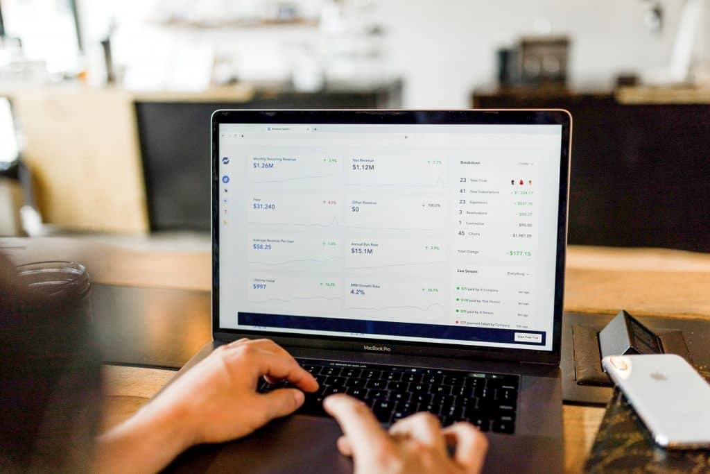
A dashboard allows viewing insights and understanding performance at a glance. The insights that we view on the dashboard are based on carefully identified key performance metrics as per an organization’s objectives and processes. Dashboards are a reporting tool that helps businesses in monitoring their performance and make informed decisions regarding their business.
An analytics dashboard is a reporting tool that helps in analyzing huge volumes of data, that allows investigating trends, get deeper insights and forecast outcomes. Therefore, the data that is used by the analytics dashboard has to be up-to-date and accurate.
It is rightly said by the former CEO of HP, Carly Fiorina that, “The goal is to turn data into information, and information into insight”.
The raw data is converted into information and the dashboard presents this information that can be consumed by the user. The user can use the information to study the performance and get in-depth insight to take calculated action. If management can make informed decisions then they can focus on areas where attention is required without any guesswork.
Every organization has its own set of objectives and goals to achieve. An analytics dashboard helps in understanding and planning how to achieve their goals. Also, the company must get to view their data more interactively, have the ability to drill-down further to get more clarity and identify trends.
Aventior has extensive experience in developing technology for the life science industry. A clinical research company hired Aventior to develop a configurable analytics dashboard to gain insight, view key performance indicators (KPI), and report on the site/study/participants.
Approach
The client has an extensive amount of information vital to the customers. Aventior had to develop a dashboard that provides a mechanism to control the display of the new study dashboard for each product as well as customer instance with answers to relevant business questions. The dashboard should also allow the user to configure widgets of visualization across various KPIs. To integrate these functionalities, the technology used by Aventior is Vue.js for the front end, which is an open-source JavaScript framework for developing user interfaces, and for the backend, JAVA integrated with Node.js.
The dashboard developed was in two phases:
Phase 1.0 – Base-Standard Dashboards
Phase 2.0 – Pro-unlock additional dashboards/configurable dashboards
Aventior used the calculation code for each priority grouping KPIs. Aventior team tests and fixes all the KPI visualization bugs and deploys the code to stage/UAT/Prod environments.
Impact
Developing an analytics dashboard involves creating a user-friendly platform, allowing users to configure widgets of visualization, and representing KPIs in a glance. Aventior developed a dashboard that allows users to configure widgets of visualization based upon multiple roll-ups and slices of data across various KPIs. The platform provides a mechanism to control the display of the new study dashboard for each product and customer instance. The users with appropriate access rights to use the portal can view the dashboard. They can view the key performance indicators (KPIs) through interactive visualization, that is displayed on a configurable dashboard. The users can gain insight and reports of their study, site, or participants. The users can configure the types of visualizations, display the visualizations, and download the data generated from the Metrics Dashboard KPIs.
Aventior has developed a configurable dashboard that gives users the ability to access a group of KPIs. The KPIs are organized around a few relevant business questions that the dashboard metrics address. The dashboard groupings that address various concerns are as below:
- Overall Study Executive Dashboard: Does it predict the health of a study?
A grouping of high-level metrics related to enrollment, compliance, and data completion is represented by this dashboard. It provides insights such as:- Determine the expected completion date for all activities
- View in a glance enrollment curves by country and site
- Identify daily activities that cause non-compliance
- Study Enrollment Dashboard: Does it display target achieved and forecast enrollment goals?
This dashboard represents a grouping of detailed analytics that represents enrollment trends. at a glance, the below trends can be viewed both country-wise and site-wise:- enrollment curves
- site activation and first visit progress
- eConsent comprehension quiz metrics
- review screen failure ranking
- Activity and Overall Engagement Dashboard: Does it help find out if any user is struggling with any particular activity areas in the technology?
This dashboard represents a grouping of detailed analytics representing engagement trends. This includes:
-
- Identifying any area in particular with different engagement levels by site and country
- Find if telehealth visit durations are adequate for the study
- If users are spending a consistent amount of time in the app by site and country
- Identify statistical impact in activities and training across countries and sites
- Study Compliance Dashboard: Does it identify current or predicted compliance issues?
This dashboard represents a grouping of detailed analytics representing potential compliance issues and trends. It helps identify:
-
- Daily activities that are causing non-compliance
- Data collection completion metrics to see if data entry is lagging
- Data Management Dashboard: Can it identify the status of data collection, cleaning, verification, and approval?
This dashboard represents a grouping of detailed analytics representing data management statuses and trends, such as:
-
- Activity completion percentages
- Activity completion times
- Issues and trends involving data queries
- Timeliness of queries being closed
- Timeliness of activities and forms being entered, verified, approved, and signed off
- Study Completion Dashboard: Can I view trends that may impede study completion goals?
This dashboard represents a grouping of detailed analytics representing completion trends. They are:
-
- View the expected completion date for all activities
- Spot discontinuation trends
- Review missing data and query trends by site and overtime
Aventior developed an Analytics Dashboard for the client that is integrated into their portal. The configurable dashboard answers all relevant questions which arise after the study configuration.


 +1 (617) 221-5900
 Follow Us
